Create Graph
The "Create Graph" Node has been replaced as of Version 3.6 (currently in testing stage) with a new interface. Please note that the new version is not compatible with the old version and so Create Graph Nodes built using the previous versions will need to be redesigned.
Contents
Graph Types
At present we provide the ability to create seven different types of graph, although we aim to increase this number in subsequent releases. These are:
- Standard Pie Chart
- Ring Pie Chart
- 3D Pie Chart
- Bar Chart
- Stacked Bar Chart
- Meter Chart
- Line Chart
Creating a Graph Node
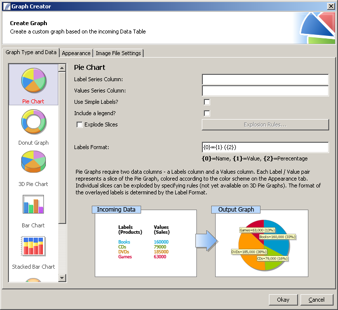
To create a Graph Node, drag the "Graph Node" icon from the Actions Task Elements list into your Task view. You will then be presented with the Graph Node Editor:
Graph Type and Data Tab
The first tab allows you to specify the type of chart you wish to create and to enter values for properties that are specific to each type. To select a type of chart click on the appropriate icon from the list on the left hand scroll pane. When a Chart type is selected the options available in the main panel will change, as will the in-line help section.
The next section of this document explains the options available for each chart type.
Pie Chart
Pie Charts are ideal for displaying comparisons of values between different items - for example, shares of votes in an election, product sales, etc.
This section covers the standard, ring and 3D pie charts (options are identical for each).
- Label Series Column - The value for this should be a Presence data table reference - e.g. :var{labels}. If we consider a pie graph to consist of name / value pairs, the Labels series contains the names of the items.
- Values Series Column - Again this should be a Presence data table reference - e.g. :var{values}.
- Use simple labels? - If checked, labels appear on top of the pie slices instead of outside the pie, which is the default behaviour.
- Include a legend? - If checked a legend will be displayed at the foot of the chart.
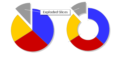
- Explode Slices - This option allows you to automatically "explode" slices of the pie chart (see image below)
Which slices are exploded is determined by the Rules you attribute by clicking the "Set Explosion Rules" button. For example a rule which states :var{value} > 10000 will explode any slices which have a value of greater than 10,000. Please note that this feature is not available for 3D Pie Charts.
- Labels Format - Determines the format of automatically generated labels. Three special markers - {1}, {2} and {3} - represent the slice name (e.g. Scotland), the actual numeric value (e.g. 557) and the percentage of the total amount (including a percentage sign). Please see the example label formats below:
| Label Format | Example Output |
| {0} = {1} ({2}) | Paraguay = 7 (13%) |
| {0} ({2}) | Paraguay (13%) |
| {0} {1} | Paraguay 7 |
| {2} | 13% |
Bar Chart
Bar charts are used for plotting discrete (or 'discontinuous') data i.e. data which has discrete values and is not continuous. Some examples of discontinuous data include 'shoe size' or 'eye colour', for which you would use a bar chart. In contrast, some examples of continuous data would be 'height' or 'weight'. A bar chart is very useful if you are trying to record certain information whether it is continuous or not continuous data.
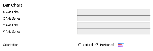
- X Axis Label - This is the label that appears along the X Axis of the graph - either at the bottom (vertical) or along the left hand side (horizontal). You may use a variable or a column reference, however typically this will be a plain text value (e.g. "Countries")
- X Axis Series - This is the data series which should be used for the X Axis values. Usually this will be a Presence data column reference, e.g. :var{COUNTRIES}, :var{DATES}, etc. Each available value for the X Axis Series will represent a new bar.
- Y Axis Label - This is the label that appears along the Y Axis of the graph - either along the left hand side (vertical) or along the top (horizontal). It can be a variable reference, data column reference, or more commonly a plain text value.
- Y Axis Series - This is the data series which should be used for the Y Axis and determines the length of the bar. This must correspond to a numeric value.
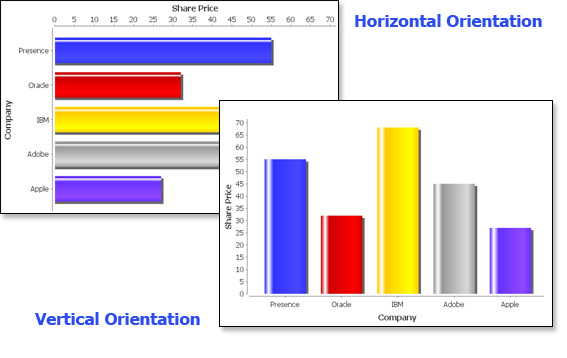
- Orientation - This determines whether the chart is arranged vertically (with bars going from bottom to top) or horizontally (with bars going left to right) - see the image below for a comparison.
Stacked Bar Chart
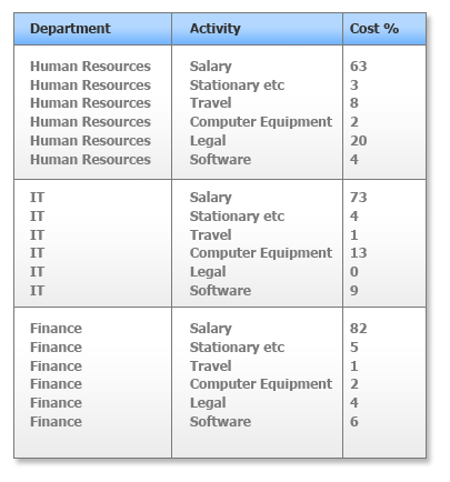
Stacked Bar Charts involve the concept of Categories of data, where each Category contains measurable attributes which can be quickly compared with each other. For example, imagine you wanted to display the comparative costs of different activities in different company departments. An incoming Data Table for such a scenario may look like this:
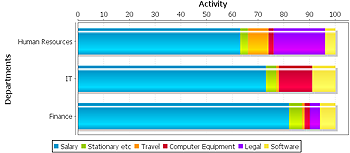
And the resulting graph would look something like this:
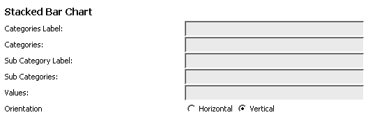
Input Options
- Categories Label - This is a text label to describe the category set, which appears at the foot of the bars - for example, "Departments". Presence variable references and data column references are permitted, but it is more usual to use a (static) text value.
- Categories - This is usually a reference to a Presence Data Column, e.g. :var{DEPARTMENT}.
- Sub Category Label - A text label to describe what is being measured - e.g. "Cost % By Activity".
- Sub Categories - Typically a Presence Data Column reference which lists the sub categories (in our example, activities) - e.g. :var{ACTIVITY}
- Values - This should be a reference to the Data Column that contains the values, with one value per category and subcategory (see the above table).
- Orientation - This controls whether bars go from top to bottom (vertical orientation) or left to right (horizontal orientation).
Meter Chart
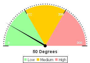
Meter Charts are useful for displaying a single value as a needle on a dial, and allows you to color-code intervals of the dial to indicate the relative meaning of the sections - for example green, amber and red sections could indicate "low", "medium" and "high" values. Please see the example below:
Unlike other chart types, only one value is required by the Meter Chart and this is the "Needle Value".
Input Options
- Graph Shape - This determines whether the dial should be a pie shape, a chord shape or a circle shape. A preview icon next to the options demonstrates the meaning of each term.
- Needle Value - This is the value which the needle points to, and is also displayed as a label beneath the dial. It may be a Presence Variable reference (e.g. ${value}), a data column reference (e.g. :var{VALUE}) or a static value (e.g. 500). Multiple charts can be created for each row if a column reference is used, however the filename of the output graph must in that case also contain a column reference. The angle at which the needle points is determined by the ranges specified in the Intervals section below. If no intervals are specified the needle will always point to 0 degrees (straight up) regardless of the value.
- Meter Angle - Use the slider to specify the Meter Angle. This specifies the part of the graph that is cut away:
(this image demonstrates a pie shape meter with the angle set to 260, 220, 180 and 140 degrees respectively).
- Show Legend? - Tells the tool whether to generate a legend for the color-coded intervals, which is placed at the foot of the image.
- Units Text - This is used to generate the value label, and indicates the units that are being measured - e.g. "Degrees", "Euros", "Kilograms", etc.
- Intervals - Use the "Insert Interval" and "Remove Interval" buttons to insert and remove color-coded intervals. Each interval has a title (used in the legend - see above), a lower value and an upper value. Values must be static, i.e. cannot contain variable or column references.
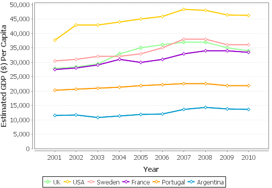
Line Graph
Line Graphs plot a series of points on an X-Y graph joined together by a line. Here is an example:
Three values are required for each point on the graph:
- Category
- X Value
- Y Value
And points belonging to the same category are joined together. Each line is given a separate colour and (optionally) a different data point marker.
Input Options
- Category Values - Specifies the names of the Categories (lines) and will usually be a Presence Column Reference (e.g. :var{COUNTRY}). If a static value is used only one line will appear on the graph.
- X Axis Label - This is the text label that is displayed along the X Axis.
- X Axis Values - Specifies the values for the X Axis, which will typically be the same for each Category. Usually this will be a Presence Column Reference - e.g. :var{YEAR}.
- Y Axis Label - This is the text label that is displayed along the Y Axis.
- Y Axis Values - This determines the position on the Y Axis that the data points will be placed and will usually be a Presence Column Reference, for example :var{GDP}.
- Orientation - Determines whether the graph should be vertical (lines go left to right) or horizontal (lines go top to bottom).
- Line Style - Determines the style of the lines used. May be Solid Lines, Short Dashes or Long Dashes.
- Data Point Bullets - Choose between "None", "Diamond", "Square", "Circle" or "Mixture". If "None" is selected lines are uninterrupted by bullet points.
Appearance Tab
Introduction
The Appearance Tab allows you to specify the color scheme to use, in addition to previewing the graph with a previously saved Data Set.
Color Scheme
Chart Color Cycle
A series of color swatches is available that can be edited by clicking on them. Up to 15 colors can be added by clicking the "Add" button. Each section in the chart - e.g. bars in a bar chart, sections in a stacked bar chart, slices in a pie chart, etc - will use the appropriate color in order of appearance. If there are insufficient colors for the number of sections the first color will be reused after the last, and then the second and so on.
Meter charts use the Chart Color Cycle to determine the colors of the ranged intervals.
The remaining available colors represent the background color, outside color, shadow color and title color, although these do not always exactly represent what they are coloring, depending on the type of chart. For example the Meter Chart uses the "Shadow Color" to determine the color of the needle. We hope to make this more intuitive in the future.
Load / Save Color Scheme
This allows you to save a color scheme to disc for future re-use, or load a previously saved color scheme. Color schemes are saved as a small XML file to your local drive.
Graph Title
This determines whether a title should be included, and if so the text of the title (e.g. "Sales Forecast").
Generate Preview
This allows the user to generate a preview of the graph with the color scheme specified based on either:
- Default (auto-generated) data OR
- Custom data
If Custom Data is selected, the values of the first tab (Graph Type and Data) must correspond to the data table that is used. In order to generate a Custom Dataset, you must do the following:
- Create a Task which selects or generates the appropriate Data Table.
- Insert a "Write Context to XML" Node after selecting the Data
- Run the Task through the Debug engine
Once the Custom Dataset has been created you can select it by clicking on the "Select Data File.." button. You will then be presented with a view of the Data Table.
Image File Settings
This Tab controls the settings for the output image file. In the "Graph Dimensions" section you can manually set the width and height of the output image - although it is worth noting that resizing the "Preview" graph will adjust these values, so you may find this an easier method.
Image Type
Under the "File Settings" section you may choose between a GIF image (Graphics Interface Format) or a PNG image (Portable Network Graphics). The former tends to create smaller files provided the number of colors and complexity is low, otherwise PNGs will tend to be more efficient. Some very old Web browsers may have trouble displaying PNG images.
Destination File Location
This tells Presence where to write the generated image file to. Note that this value can contain a Presence column reference. If this is the case, a separate graph will be generated for each possible value, and the rows associated with that value will be used to determine the data series.
Feedback
We welcome customer feedback and suggestions for improvement, especially as this is a new feature of Presence. Please email pryor@presencebpm.com with any thoughts you have.
See Also
Task Elements : Action Task Elements : Create Graph
| Send Email | Send SMS | Send Fax | Broadcast Messages |
| Read Text File | Read Binary File | Write Text File | Write Binary File | Parse File Action |
| Rename File | Copy File | Delete File | Parse File Action |
| Generate Bar Code | Read Bar Code |
| Dynamic Task Call | Call Native Program | FTP Upload | Scorecard Collector | Create Graph | AS400 Action |
| Socket Client Action | Socket Server Action |
| JMS Producer | JMS Consumer |
